BIOLIA Saffron Packaging Design
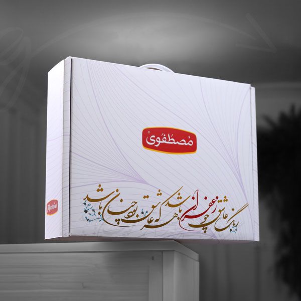
Saffron’s Packaging should not only represent the product but also its origin and where it came from. and that was exactly how Biolia was created. Our agency wanted to show off this concept in Biolia’s Saffron Packaging design by using a simple-yet-luxury theme that would suit the product as well as its brand. With a simple glance at the packaging design, you’ll see a beautiful poet by Hafez combined with a pattern of birds and flowers very common in Persian rugs and tiles. the right combination of elements here represented a symbol of growth associated with saffron’s original identity.
In both themes (light and dark) we tried to make the design look modern and luxurious by using light fonts and elements along with golden foil printing. Aside from the design itself, we counted on quality printing services, and needless to say, we got it. Services like UV, flat cellophane, and gold printing foil were done properly. hopefully, producers of saffron and designers of its packaging will value this product and want to associate it with Iran much as we do. All of Biolia’s product packaging was designed by ZarifGraphic Agency alongside Mrs. Sahar Jodaei’s collaboration. This sliding box packaging holds a metal container for the saffron that’s sealed with a label. The product was printed by ZarifGraphic and photographed by ZarifGraphic Studio in collaboration with Karno Studio.




Comments(0)