Salman Lemon Juice Labeling Design
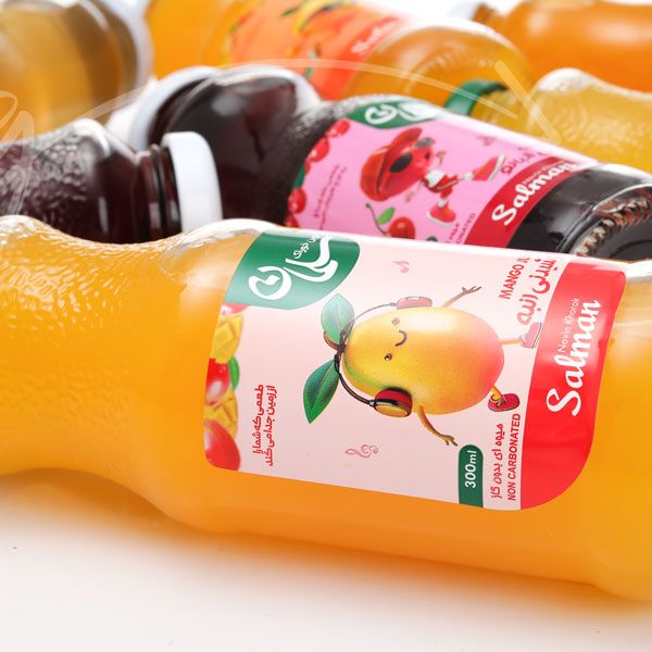
Among our recent projects with Salman Novin Khorak, the time for designing this brand’s lemon juice packaging was here. we know the obvious of how the packaging design should come about and the way it’s supposed to look like. the challenging part was of course execution. but given the output, we’d say we managed.
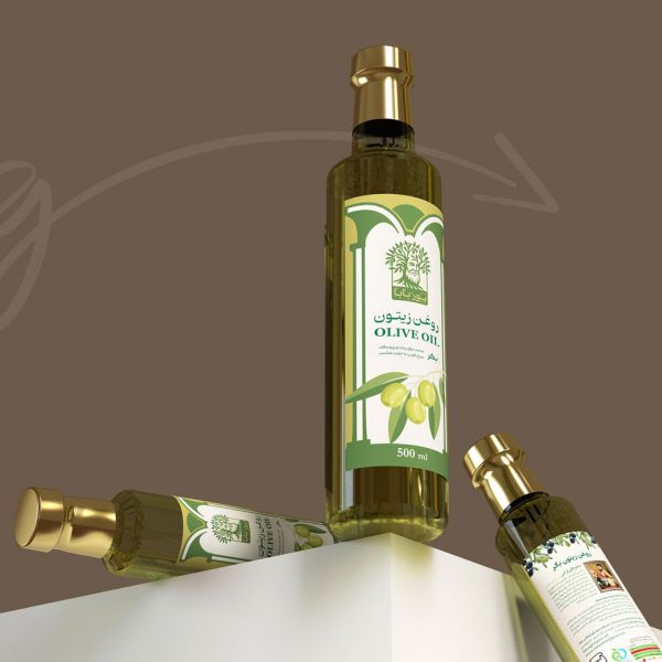
The theme was pretty much about a fresh, natural, and healthy look that’s also suitable with the see-through bottle revealing the green lemon juice.
The metalized printing features on the label give it a much more attractive and eye-catching appearance and furthermore was able to focus on the crucial parts of the label such as the name, brand, and image of the product.
The background on the other hand plays its own role. the illustration of lemons in light green and yellow gave a fantastic contrast with the metalized dark colors and more importantly a lovely sense of depth to the whole design.
The product and packaging photography of Salman Novin Khorak was Also done ZarifGraphic Studio alongside Karno Studio collaboration.



Comments(0)