KIA Tejarat Trading Company Logo Design
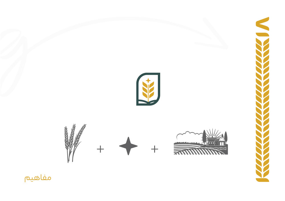
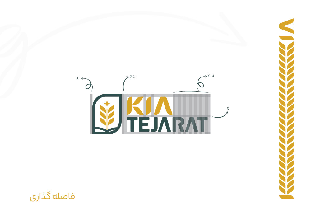
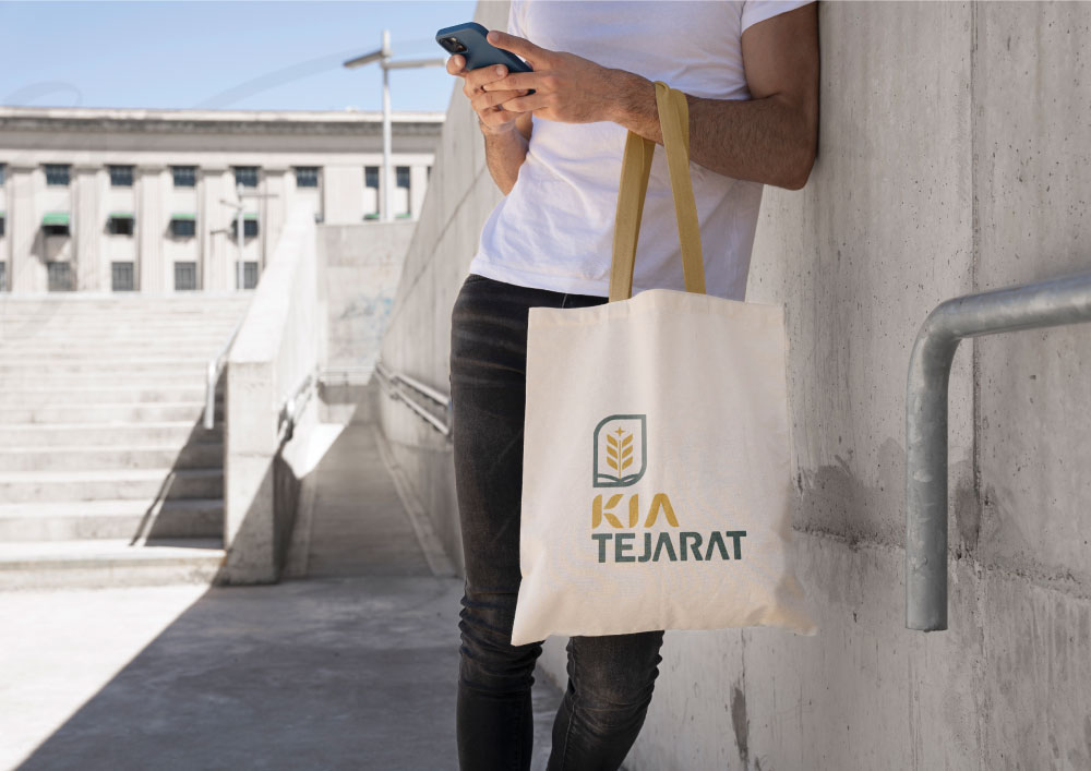
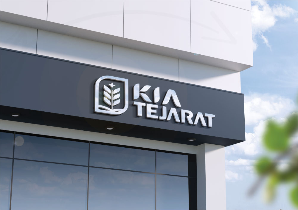
Kia Tajarat is a trading company that specializes in grains. Traditionally, trading company logos often feature common and popular elements such as the globe or back-and-forth arrows. However, in this design, we have taken a different approach by incorporating wheat and surrounding elements to represent the trading aspect. The shining star symbolizes the quality of the product and its importance to the target audience. Additionally, we have created a unique and visually appealing identity by using the same wheat cluster. The brand's colors, which are yellow and dark blue, represent credibility and growth, as well as power and stability, respectively. The logo guideline for Kia Tajarat was extensive, spanning over 40 pages, and we are able to share a limited number of images with you.


Comments(0)