The visual identity design of Mosoco auto parts
2025-Apr-06
166
0
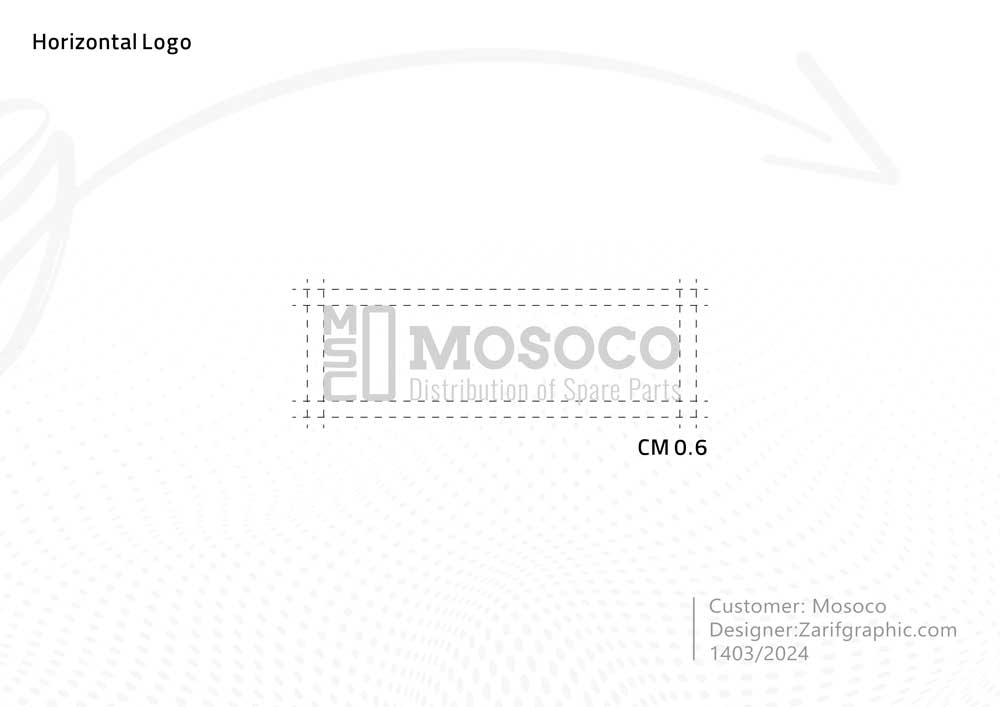
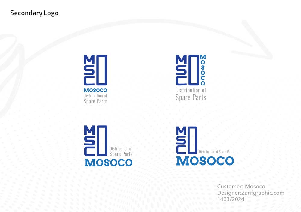
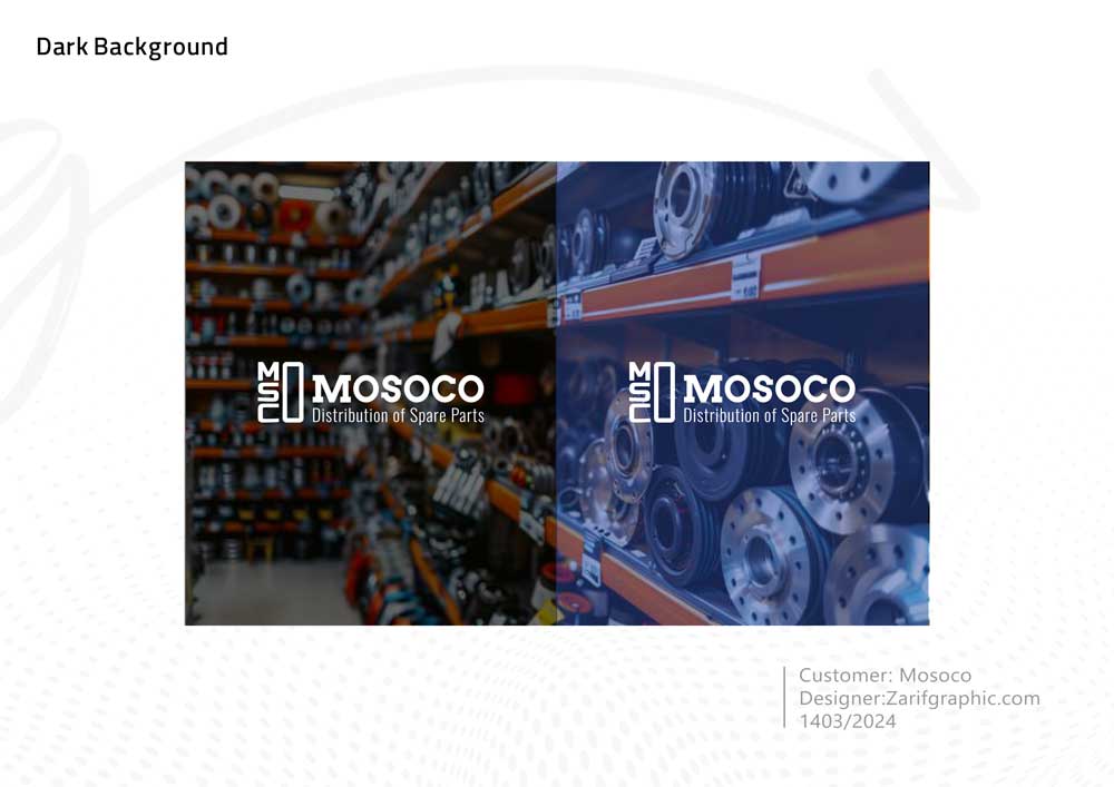
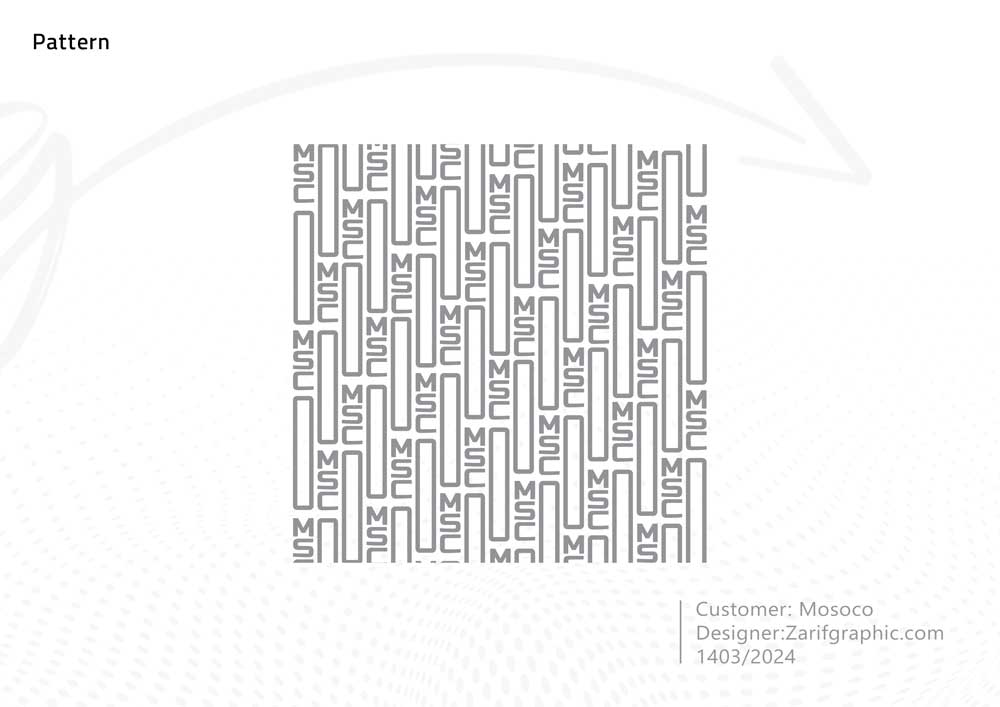
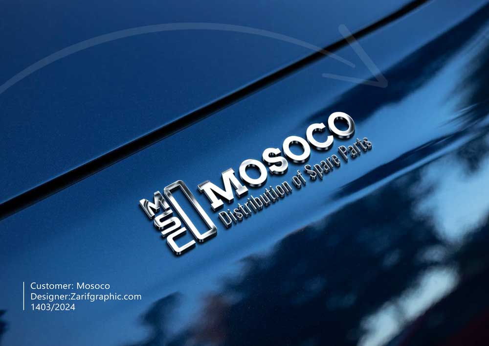
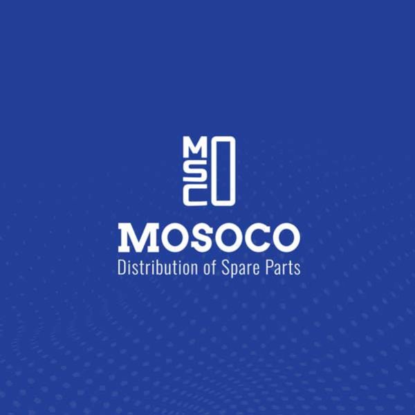
The "Mosoco" typography logo is derived from the initials of the company's name (Mohammad Soltani Company) and has been designed by intelligently combining the letters M, S, and C to create a cohesive and modern identity. The shared use of the letter O in three parts of the name not only creates visual harmony but also, with its gate-like shape, conveys a deep concept of transformation and entering a new era. The color palette of blue, navy, and gray enhances the sense of trust, technology, and sustainability in the design. This logo represents
the forward-thinking spirit of a brand in the auto parts industry that engineers the future with precision


Comments(0)