GERALDTON Greenhouse Logo Design
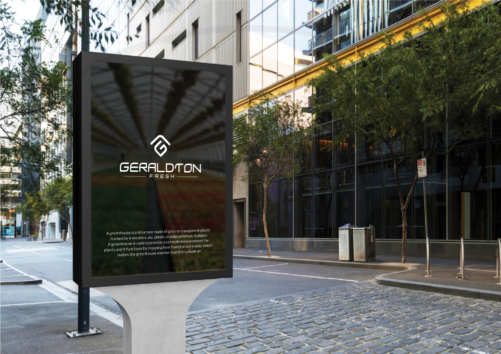
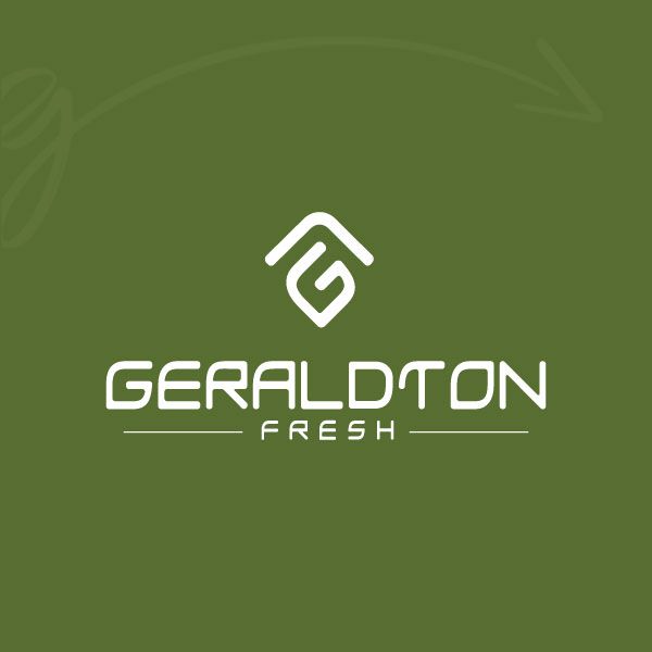
The Geraldton greenhouse, located in the city of the same name in Australia, required a logo that would effectively represent its local and legitimized business. Our primary objective in designing the logo was to maintain a simple yet impactful design that would capture the essence of Geraldton's visual identity.
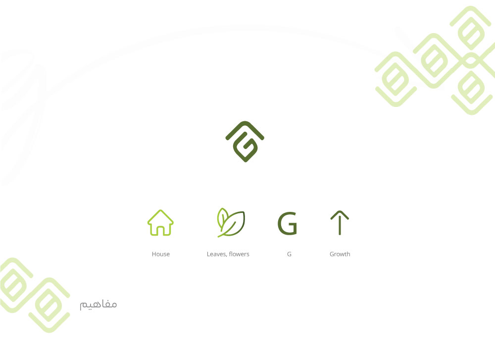
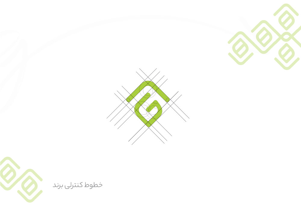
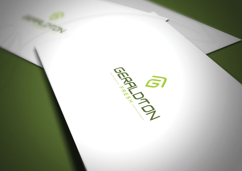
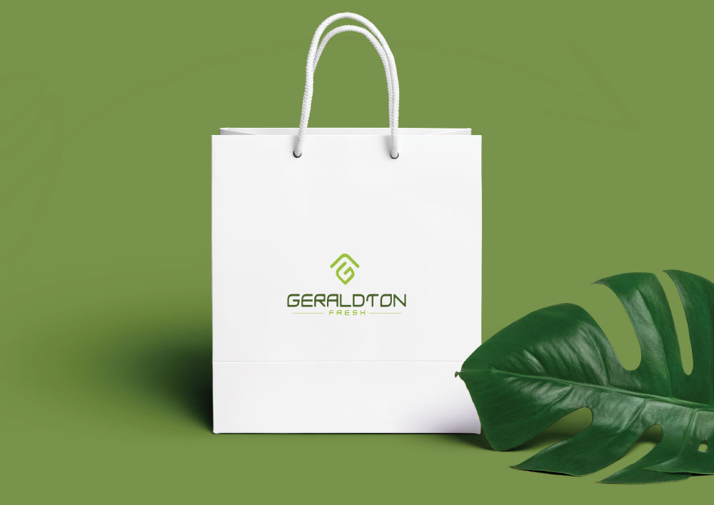
The resulting logo features an upward-slanting arrow that symbolizes the greenhouse and, of course, a safe space. The design is striking to evoke a sense of nature and tranquility. Additionally, the first letter of GERALDTON is incorporated as a leaf, representing the greenhouse's products. The leaf is designed to blend seamlessly with the natural theme of the greenhouse.
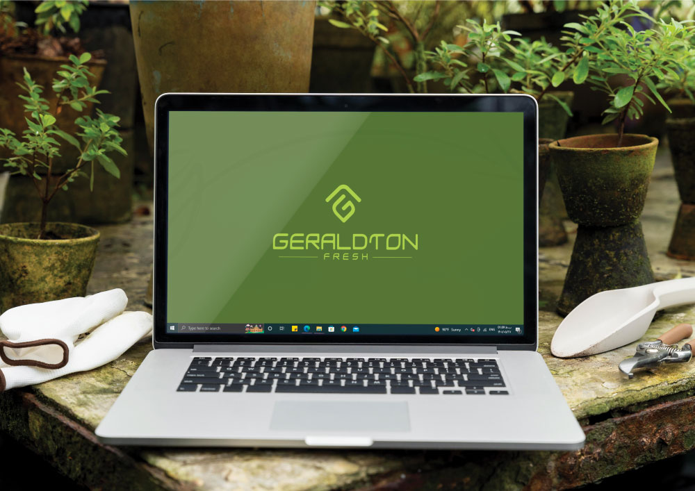
To complete the trademark, we opted for the color green, which is synonymous with nature and growth. The final presentation and visual identity guide were presented in a comprehensive document spanning over 40 pages.



Comments(0)