Farhad Cosmetic Business Logo Design
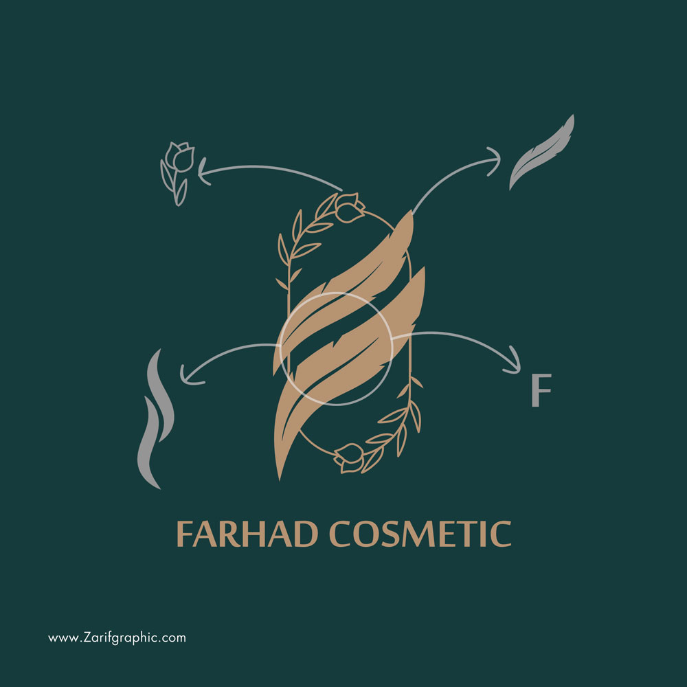
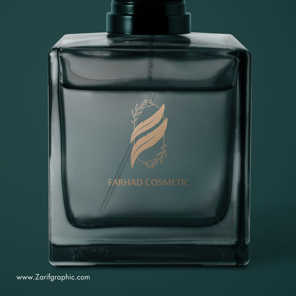
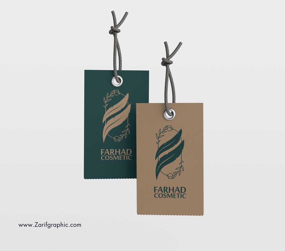
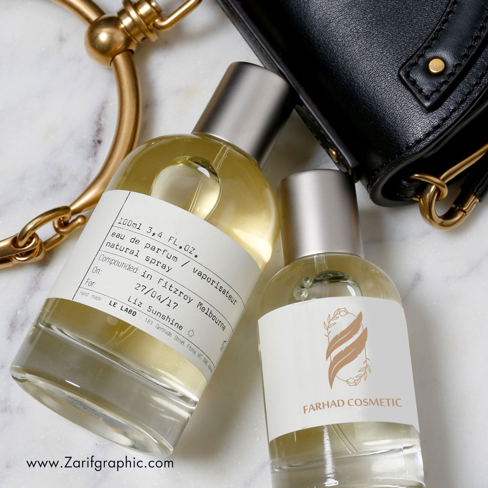
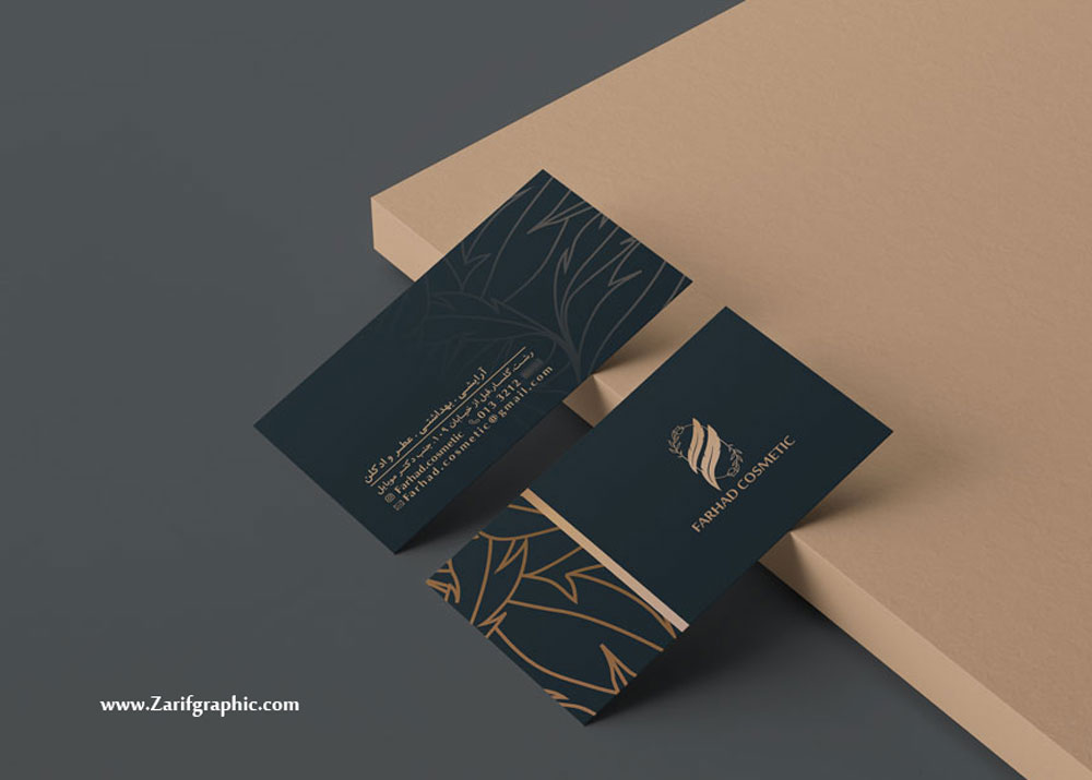
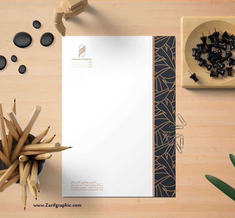
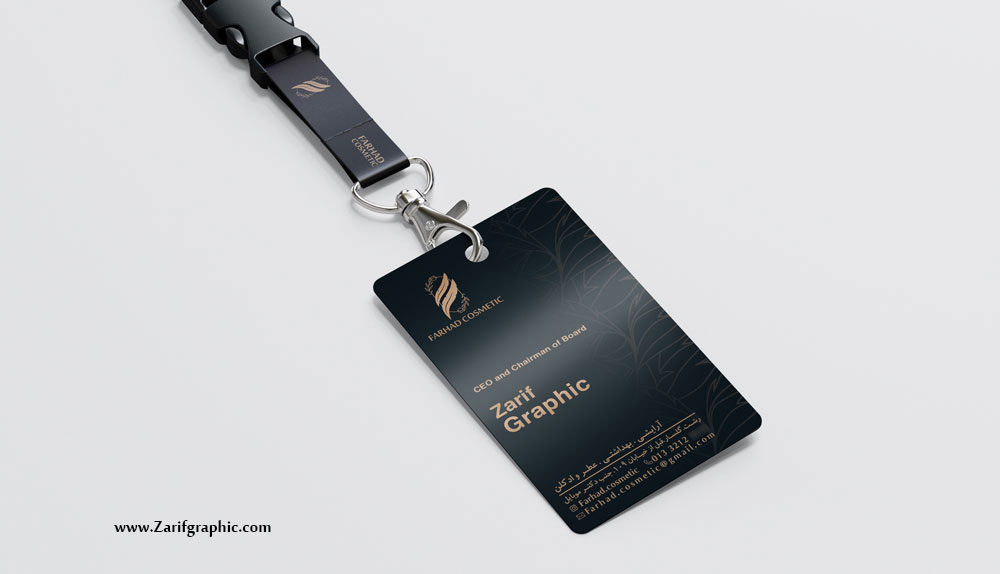
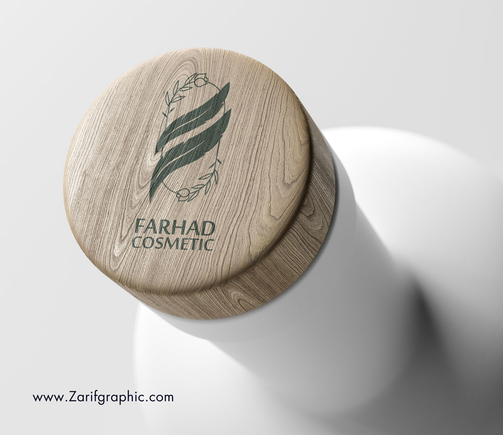
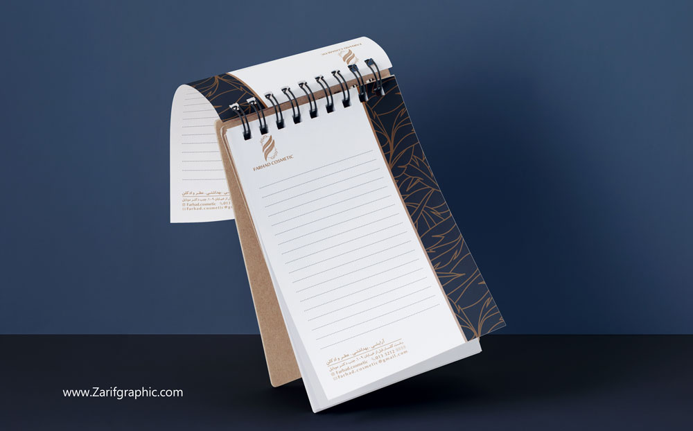
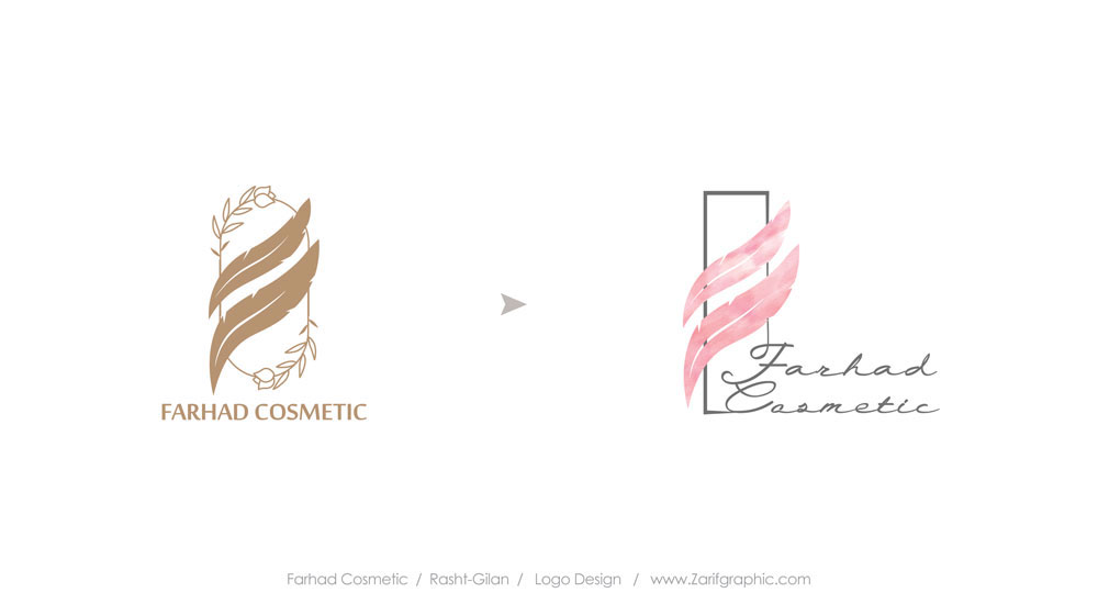
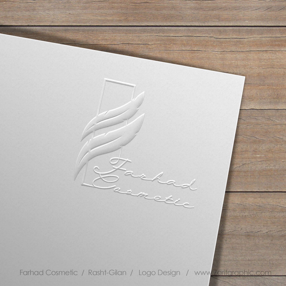
For Farhad Care and Beauty, we needed to create a logo that engaged and connected with their customer base while also conveying a message consistent with the company’s image. We chose a gold tone as the visual identity colour, as it represents a sense of luxury and is suitable for both men and women. Additionally, we combined "F" the brand's first letter, with two feathers as a symbol of softness and pleasantness and a floral frame surrounding it to capture an interesting aesthetic in the logo design.
September 2020 Update
Just like people, brands grow. And not just from a marketing standpoint. Over time, they shift and expand their ambitions, beliefs, and even their perspective. But it’s not official if others can’t see it.
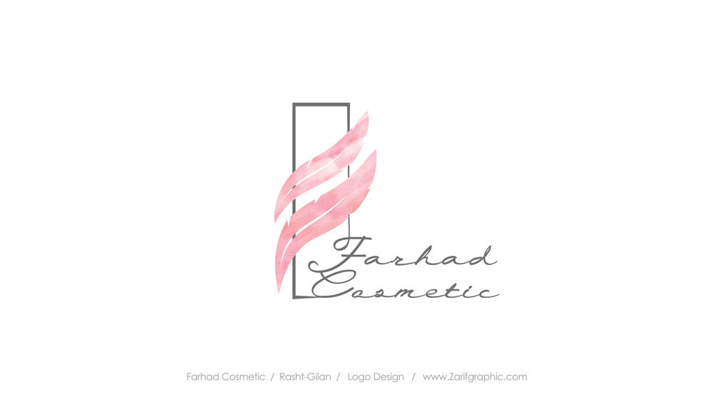
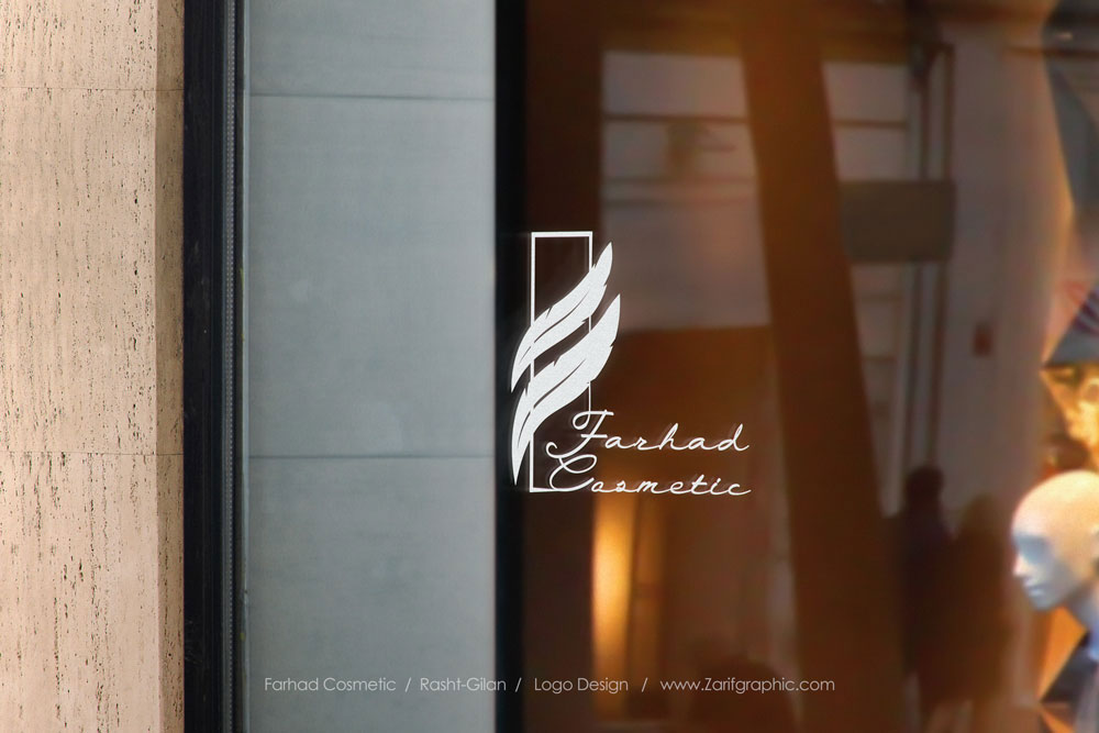
We were requested to redesign the logo and reflect it on the new adjustments. The base elements stayed the same. However, we simplified the frame, changed the feathered colour to pink and added additional type to the logo to make it even more unique. These design components have helped Farhad Care and Beauty not only stays relevant but also display their brand identity to their customers.


Comments(0)